-
Architects: Polly Harbison
- Area: 266 m²
- Year: 2019
-
Photographs:Anson Smart Photography
-
Manufacturers: Fisher & Paykel, Miele, Bakers Joinery, Perrin & Rose – The English Tapware Company, Santamargherita, Tovo, Wolf

Text description provided by the architects. The Lindfield House is a bold and contemporary addition that embodies the client’s combined passions for art, gardens, and colour. The colourful materiality and texture of the house is both warm and rich, whilst the monastic form and scale of the architecture install overall tranquility. Most importantly, the building carefully frames and reveals the client's loved garden. The landscape is the mesmerising star of the show.


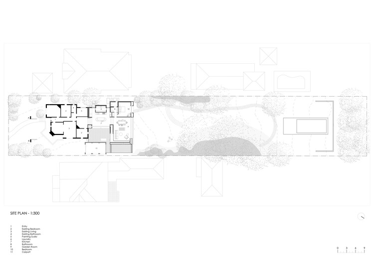
The design is a deliberate play on a scale that compliments the proportions of the large, lush landscaped back garden. The scale of the dwelling moves from the original domestic scale, opening up to the grand scale of the garden. The additional floor area is not large, however, the rooms take on an exaggerated size, with soaring ceilings and super-wide walls. The new spaces are bold and confident in their identity. Enormous openings draw the garden into the house. This change of scale between old and new creates the illusion that you could almost touch the end of the garden 100m away.


This play on the scale is reflected in the details including varying the size tiles in the patterned floor and reinterpreting the small existing round window by creating an oversized circle opening in the outdoor shower room

The new kitchen courtyard is the heart of the design. Complimentary materials sympathetically knit the old and the new together. This careful consideration of the threshold between the original and new allows each part to retain its individual identities. The house responds to both its street and the garden context. Framed snippets of views to the neighbours roofs are a small reminder of the suburban context. From the garden itself, the height of addition edits out all reference of the existing house and it becomes a contemporary form in the landscape.

The owners want this house to be their forever house. The program was organized accordingly The existing building accommodates the kids' area and the beautiful cosy living rooms are retained. The new master bedroom and garden living room open to the rear garden. Critically, the - Kitchen is located in the centre, linking both parts and equally servicing the existing and new living areas. In time, as needs change, the house can function as separate compartments. The orientation of the new Kitchen Courtyard brings northern and eastern light into rear living spaces and facilitates cross ventilation. External timber screens slide to block out the western sun from the large garden-facing openings.

Close integration between interiors and the architecture is the key success of the project. A fantastic and inspiring collaboration with Arent and Pyke brings richness and warmth to the project. Meticulous care was taken on the colour palette and materials used. Tom Ellicott from Concept Green matched this palette with his planting. The strong and bold architectural form is complimented with abundant texture and colour and a rich array of flowering plants. A heady mix that works because of the scale of application.


